Top Tips for an Effective Recycling Poster

recycling poster sampleEffective environmental behavior change—like any behavior change—relies on meeting people where they are. This can mean communicating at the point of action, right where and when the behavior is happening. For instance, a recycling flyer sent to a resident’s home is a fine first touch to raise awareness, but placing recycling information directly on the bins or in the area where trash is being disposed of is an important prompt that is likely to get the best results.

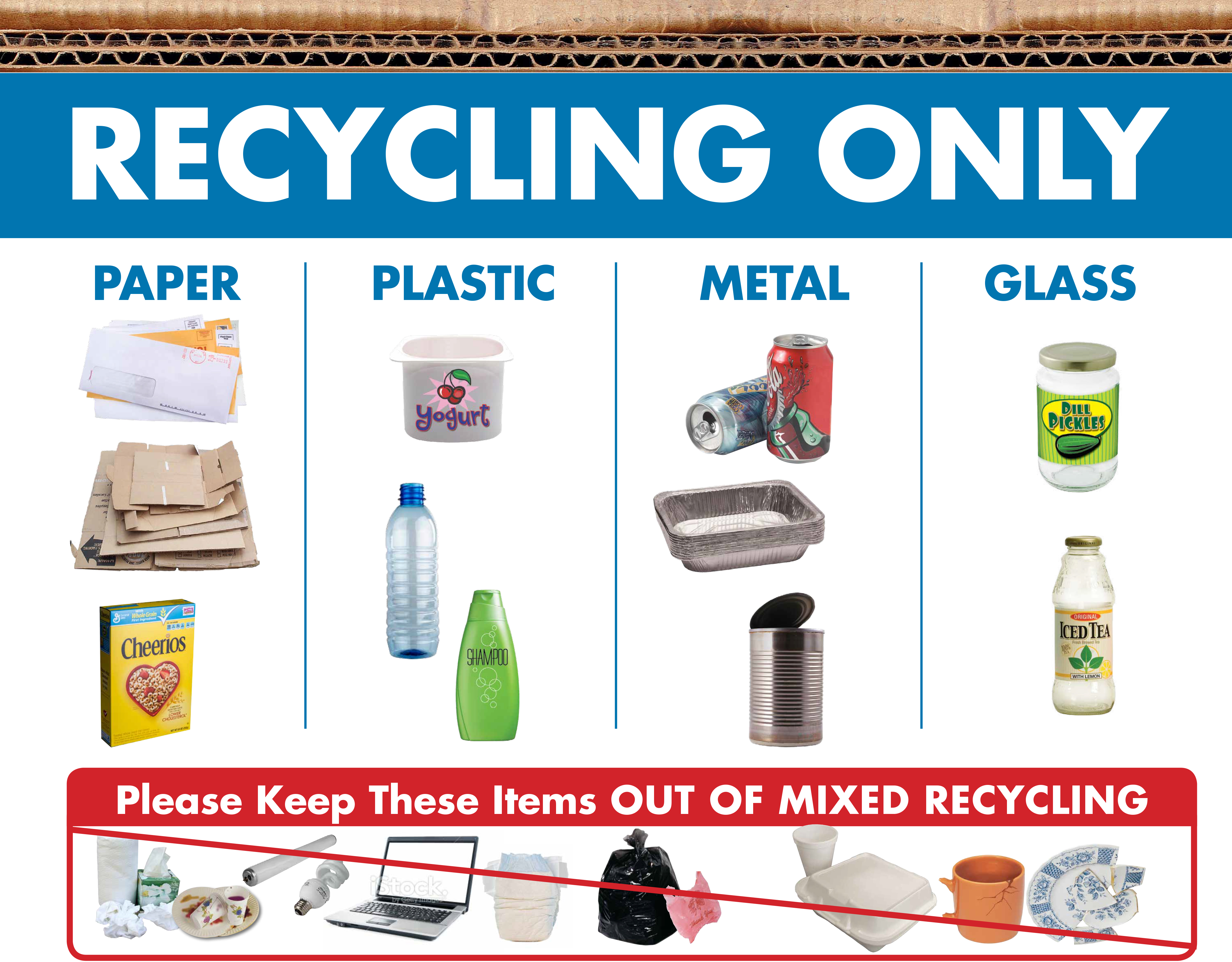
What is the most effective way to display recycling/composting information? While each case is different, there are some general rules that will help increase recycling/composting while reducing contamination:

Use consistent language.

Do you say Carts or Bins? Compost or Organics? Make sure the terms you’ve chosen are used consistently in all your print pieces, including posters and bin labels, and also match the content on your website.

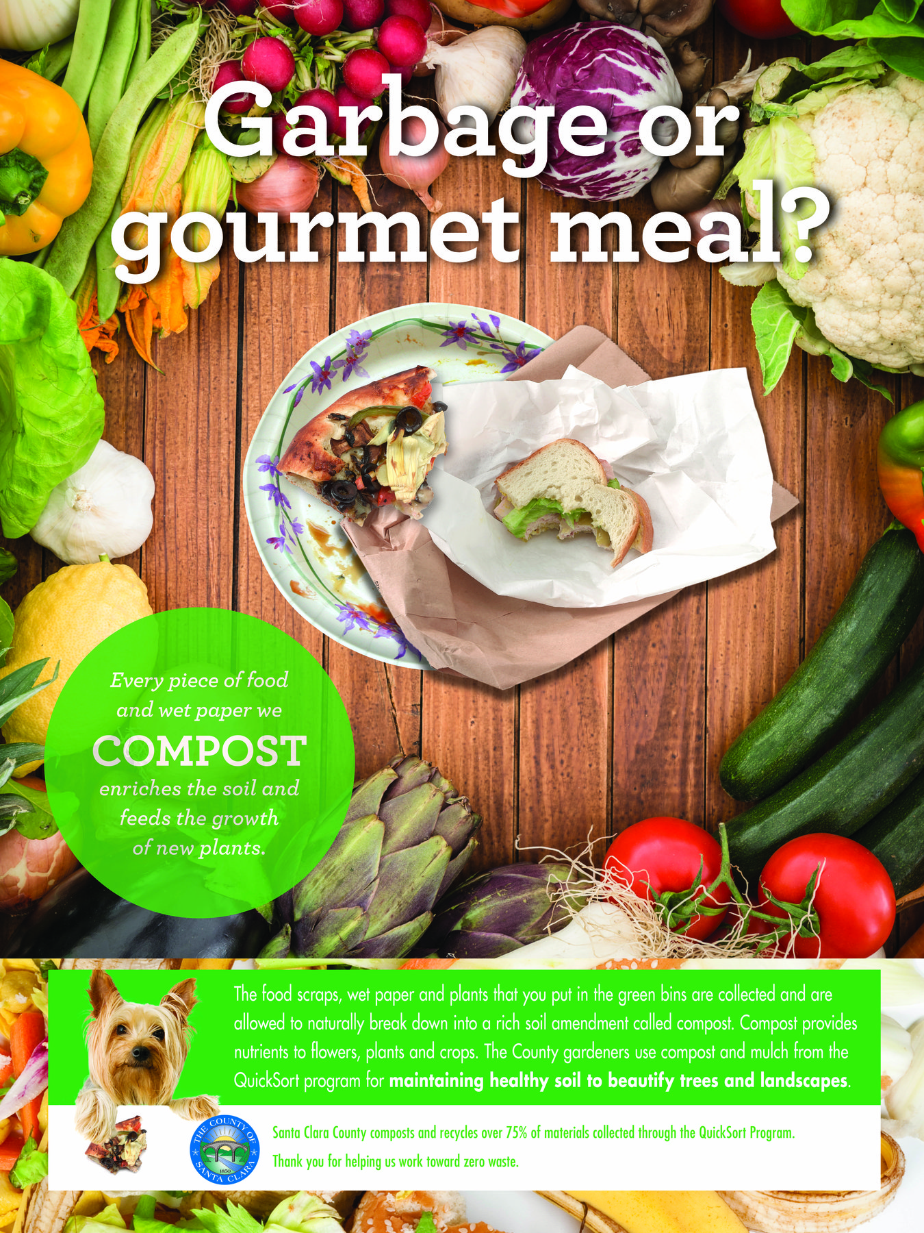
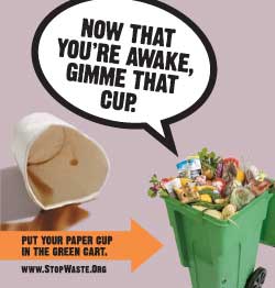
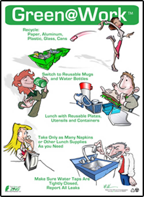
Use pictures and words.

Different people learn and remember differently – some people recall words, others, images. Using both will increase your chances of being clear and memorable. Remember that posters are typically viewed from a some distance away, so make sure images and text are sized large enough.

Be selective.

You probably don’t want to list EVERY single item that can go into the recycling or compost. Choose most common items or those often placed incorrectly. The selection of items also depends on where the poster will be used—items recycled in an office are likely different from those recycled in a restaurant kitchen.

Keep it neat.

A clean and simple layout is most likely to keep the focus on proper sorting. If a poster has too much information it may be perceived as too much effort to understand and get ignored. If you’d like to point to details, include your website URL prominently.

Stay up to date!

Did bin colors change with the new hauler contract, or are you now accepting some items for recycling that you weren’t before? Make sure your print and online collateral match your current program.

For further tips on displaying recycling information, see

5 Tips to Turn Your Environmental Outreach from “Meh” to “Magnificent”


Outreach Lessons from an Artist: Behavior Change Design

@Large installationA stunning art installation featuring the plight of political prisoners around the world got me thinking about, yes, recycling campaigns. In addition to being a moving experience, the @Large exhibit by Chinese artist Ai Wei Wei , on now at Alcatraz Island, nicely illustrates the stages we consider when designing a campaign for environmental behavior change.  The exhibit takes the viewer along a path, with different appeals and presentations at each step.

People need to come to behavior change through a process, most clearly described by Everett Rogers back in the 1960s in his book, Diffusion of Innovations. His Innovation Adoption Stages model looks like this:

Diffusion of innovation adoption stages

Intentionally or not, the Ai Wei Wei installation follows the stages, leading the visitor from awareness of the issues, through “persuasion” via a multi-sensory deepening of the experience, and finally, offers a concrete action that the viewer can take.

The @Large installation begins at the New Industries Building. It takes several forms, but the initial contact focuses on making the viewer aware of the variety and extent of political imprisonment around the world.  The floor of an enormous room is covered with portraits of political prisoners, made from LEGO bricks. At this point, the artist has not assumed that the viewer is ready to do something, but rather provides beautifully crafted “information” in the form of portraits of human faces arrayed across a huge space to raise awareness of the scope of the issue.  Books detailing the stories of each of the prisoners are present, but the viewer is not in any way forced to learn more facts and figures. The act of walking the length of the huge room with the 176 portraits “sets the problem” in the mind and heart of the visitor.

art installation @Large

The @Large exhibit continues to the cell block building, where the viewer starts to live into the experience of prisoners  – visitors are invited to enter each of 12 small, unadorned and definitely not prettified cells. There is nothing to look at, but each cell has a different recording playing, usually of the music or speech of one of the prisoners. By involving the sense of hearing and the physical experience of walking into the tiny, dingy cells, the viewer becomes more fully involved and engaged.

After several more stops, at the end of the exhibition visitors are given the opportunity to write postcards addressed to individual prisoners whose portraits they saw earlier. The sponsoring Foundation notes:  “The postcards are adorned with images of birds and plants from the nations where the prisoners are held. Cards are gathered and mailed by @Large Art Guides.”

basket of postcards
At the end, visitors write postcards to the prisoners around the world.

The viewer has been led through awareness of the issue to persuasion about the problem’s scope and importance, though information and appeals to the emotions. Only at the end is the viewer invited to make a decision to act, by writing a personal communication to one of the prisoners introduced during the first stop of the exhibition. The viewer is not urged to act before s/he has had a chance to fully digest and explore the need to communicate. And by communicating, not to a general, amorphous authority, but to a single individual, the final action becomes that much more memorable.

Not all of our behavior change campaigns can be as beautiful and meaningful as Ai Wei Wei’s @Large, but there is much to admire in the intentional layout of the exhibit that aims to touch, inspire and ultimately, change the viewer. The exhibit ends this month…go see it if you can!

@Large: Ai Weiwei on Alcatraz is presented by the FOR-SITE Foundation in partnership with the National Park Service and the Golden Gate National Parks Conservancy

Using Graphic Design to Win Hearts and Minds: Is it Possible for Government?

Man with mobile phone.According to the U.S. government’s own definition, graphic designers “create visual concepts, by hand or using computer software, to communicate ideas that inspire, inform, or captivate consumers.”

But how often do government communications actually inspire or captivate?

Our clients often say they want to “educate” or “inform” residents about their program. But in behavior change, we know that merely providing information does not guarantee action. We know we need to inspire and persuade — not just inform — and design plays a big role in meeting this challenge.

That said, we acknowledge there’s a time and place for just providing information, such as rate increases or service changes. In these cases, direct mail of a simple letter in an official envelope is the best way to cut through the clutter.

But when it comes to increasing participation in programs — from recycling and composting to planting trees — government should give creativity free rein. Here government agencies need to establish an emotional connection with the audience to overcome old habits, win over hearts and minds, and inspire change.

But wait, you say, “we need to look like we’re being responsible with taxpayer [or ratepayer] money, so we can’t do anything flashy or frivolous.” At Gigantic, we firmly believe there is a creative solution that is both engaging and appropriate, for every type of environmental campaign funded by public agencies. In fact, we’d argue that you could be wasting taxpayer money by not making it captivating. If no one notices your outreach, there’s no point in doing it.

And, we’d argue that a human-centered, thought provoking and positive concept — presented through a clutter-free design with professional imagery — has the best chance of attracting fans to your programs.

Here’s an example of one of our latest projects, for a government workplace recycling program. The project included both instructional and inspirational pieces, which were displayed separately to increase their impact. Here is one of the inspirational pieces.

food scrap recycling

Here’s another example, done for the Pentagon, which uses an emotional connection tailored specifically to the men and women charged with the security of the nation:

SCS_Pentagon1

And this campaign, done by another advertising firm for StopWaste, a public agency, is a great example of using humor to engage viewers:

122151292008cup

Wouldn’t you say these examples above have a better chance of increasing participation than a sign, like the one below, that merely tells us what to do without explaining why?

gaw

We know it’s not always easy to be captivating, but given the myriad messages that people are bombarded with every day, it’s more important than ever for government communications about environmental programs to offer more than just instruction. Government communications should include vibrant, contemporary images and catchy concepts to increase the receptivity of the message and therefore, the effectiveness of the outreach.